Nui Markets Mobile App Overhaul
- Client
- Nui Markets
- COMPLETION
- 2024 - 5 months
- PLATFORM
- SaaS, Mobile App
- MY ROLE
- As the sole product designer in this company, I collaborated with a product and development team to lead the company's adoption of the Material 3 design system and educate and train the team on the new design system. Through a collaborative effort, I identified the mobile app UX and UI issues and proposed design recommendations to the team. Additionally, I spearheaded the creation of UI designs and interactive prototypes, ensuring a seamless and consistent experience across all platforms.
- TEAM
- Rebecca Swinson (COO), Michaela Cusin (Product Manager), Tim Van Der Hulst (CTO), and Dixon Cheng (Senior Software Engineer)

Overview
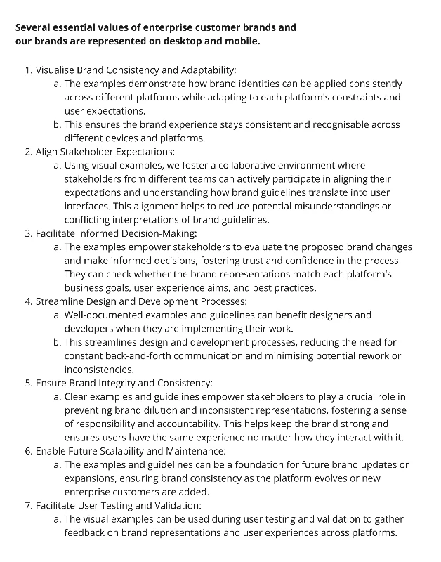
Nui Markets is a B2B digital trading platform for agricultural commodities that offers buyers, sellers, and traders visibility of real-time data and up-to-the-minute pricing. The Nui Markets mobile app requires a comprehensive visual and user experience overhaul to update its Material 3 appearance, address functionality issues, and brand alignment with the Nui Markets brand and client brand identity.
The Plan
Before we began the project.
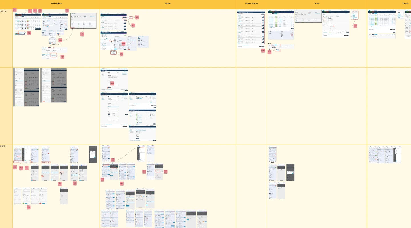
I conducted a UX audit of the mobile app, capturing screenshots and thoroughly documenting all functionalities. I identified and discovered areas that needed improvement and made detailed notes about them.
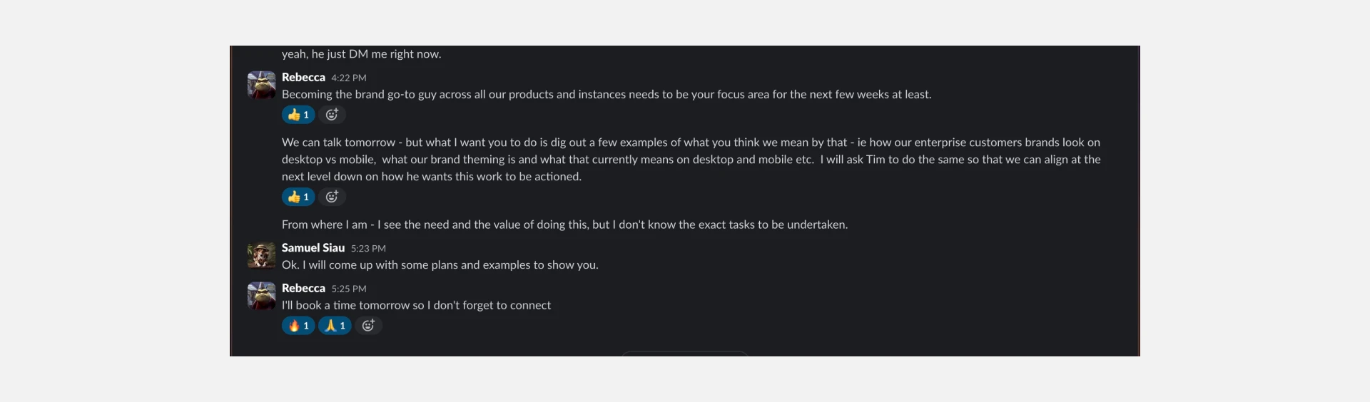
After presenting these improvement areas to the stakeholders, I communicated the importance of action and bringing value and output. We have agreed to proceed, but we will do so gradually.
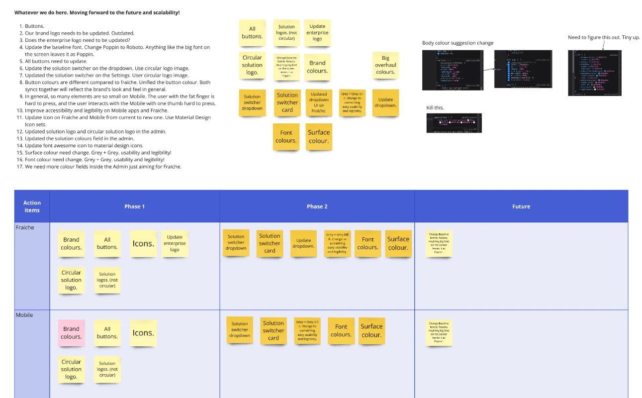
Overall, areas for improvement and overhaul were identified.
- Theming and branding.
- Usability issues and legibility issues on the mobile app.
- Prioritisation content and cluttered layout.
- Address functionality issue.
Additionally...
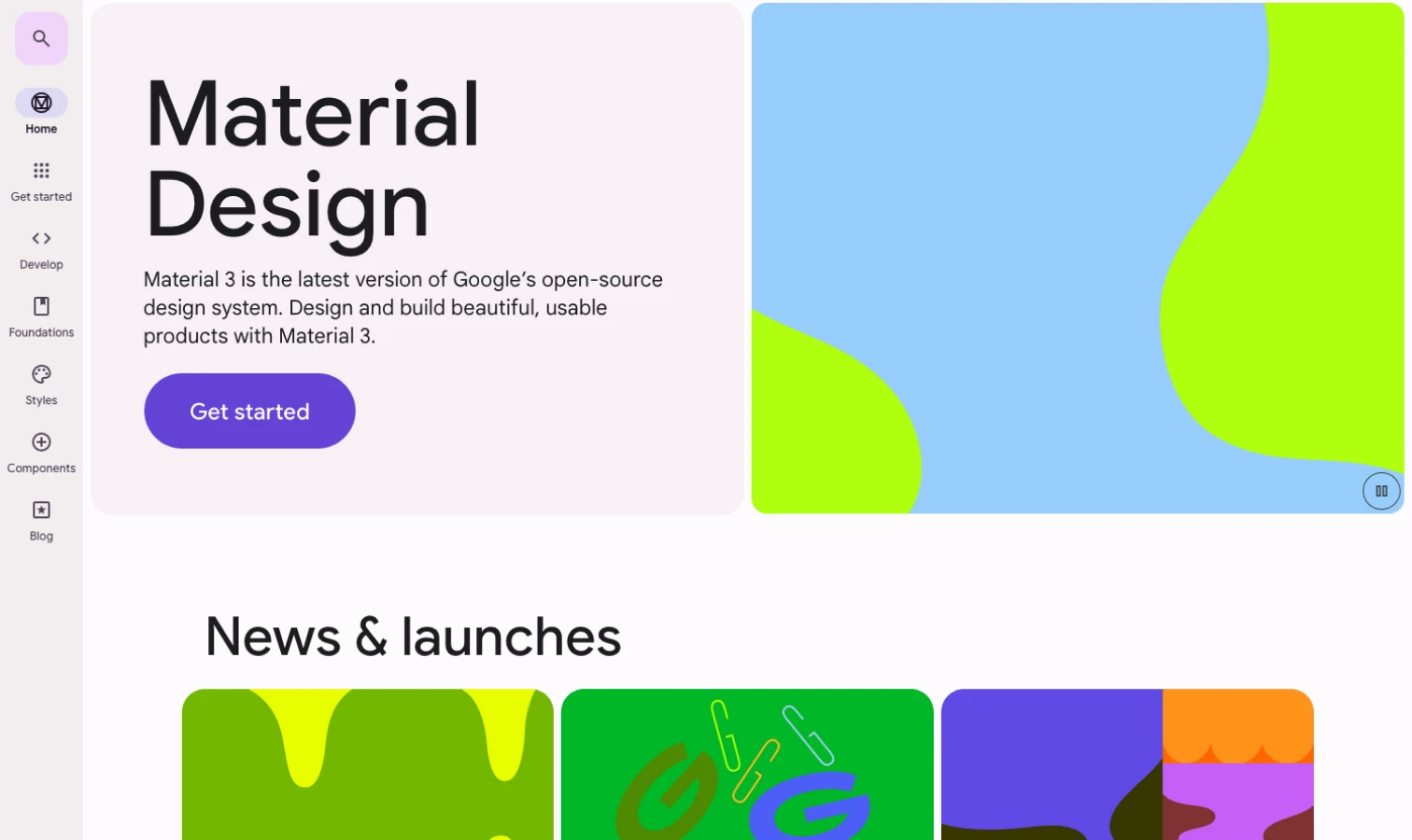
Additionally, the company transitioned to the Material 3 design system based on business decisions and technical requirements. I had some knowledge about Material 1 and 2 because I had used them before. Still, I needed to learn about Material 3 design and spearhead educating and training the team on the new design system.
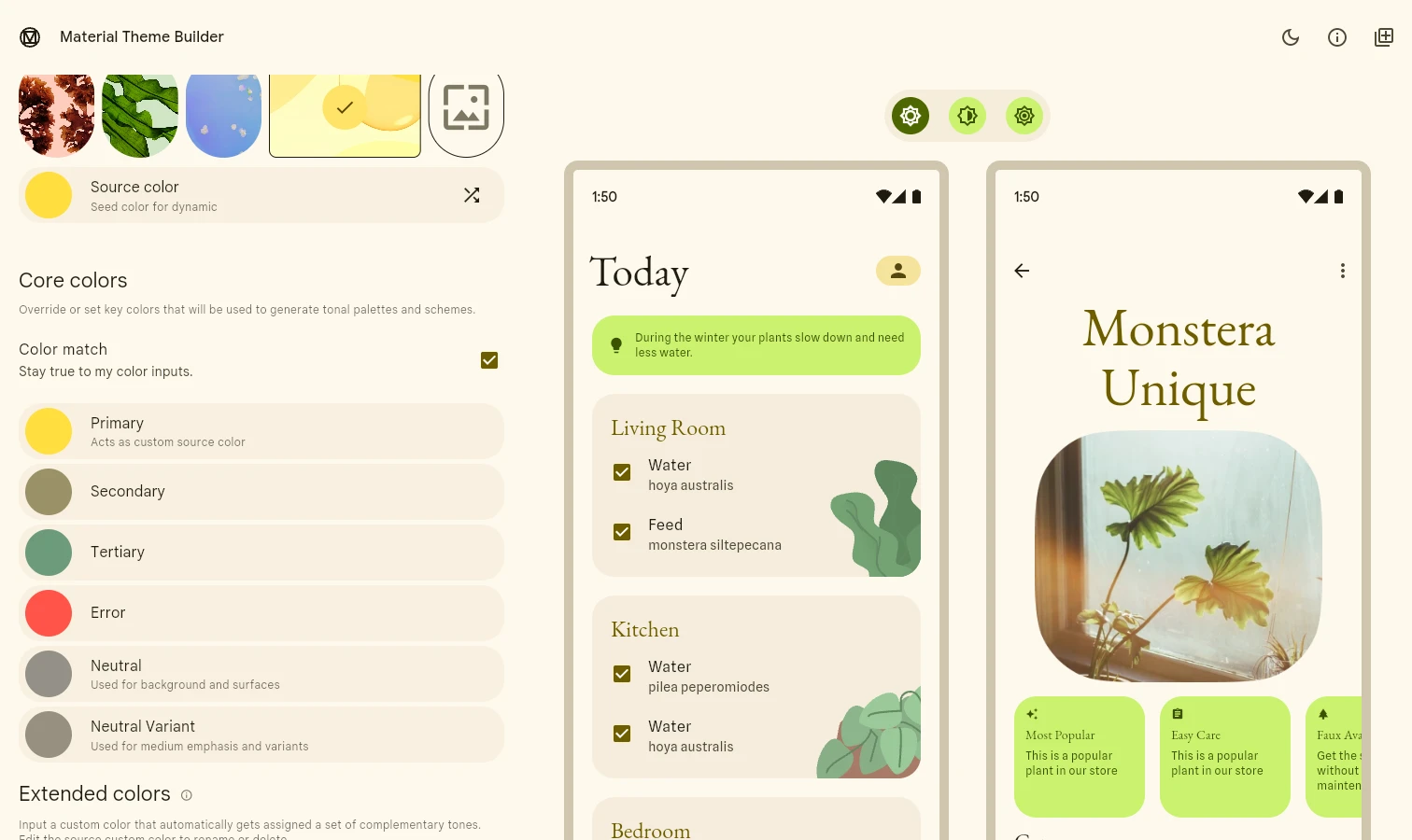
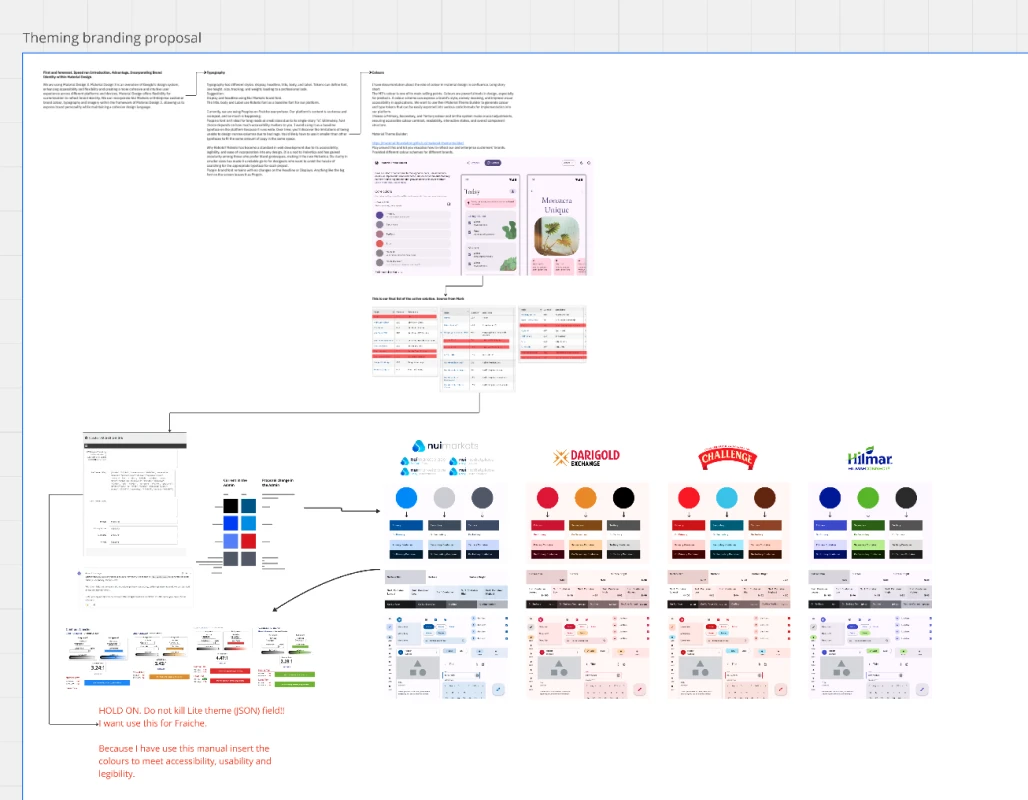
Regarding the colours, the colour of the Material 3 design is one of the main selling points of its features. Therefore, use Material Theme Builder to generate a colour scheme. Choose a primary, secondary, and tertiary colour and let the system make crucial adjustments, ensuring accessible colour contrast, readability, interactive states, and overall component structure.
Colours are a powerful design tool, especially in product design. They can express brand and style, convey meaning, and enhance visual accessibility in applications, such as mobile apps.
The theming and branding
The problem
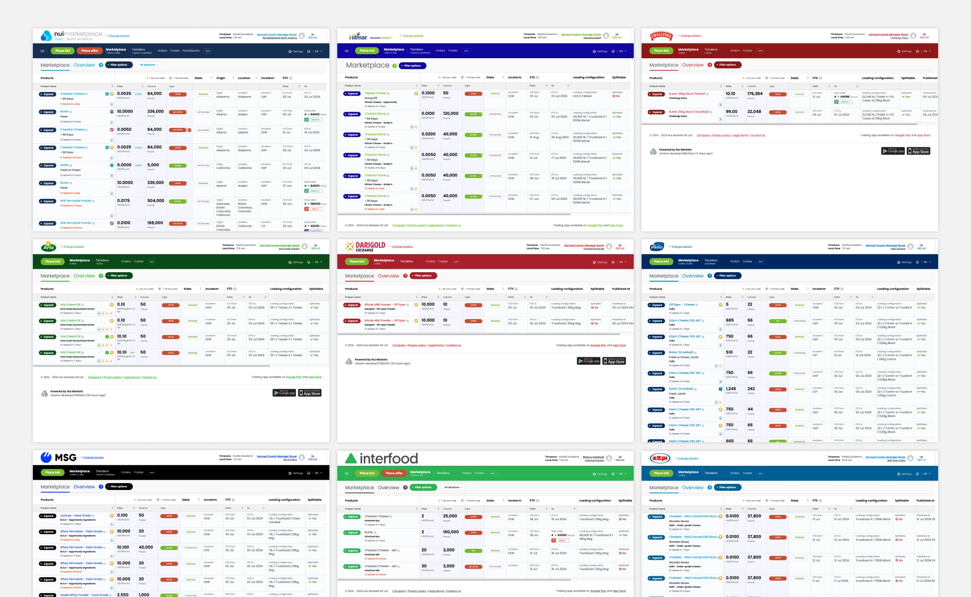
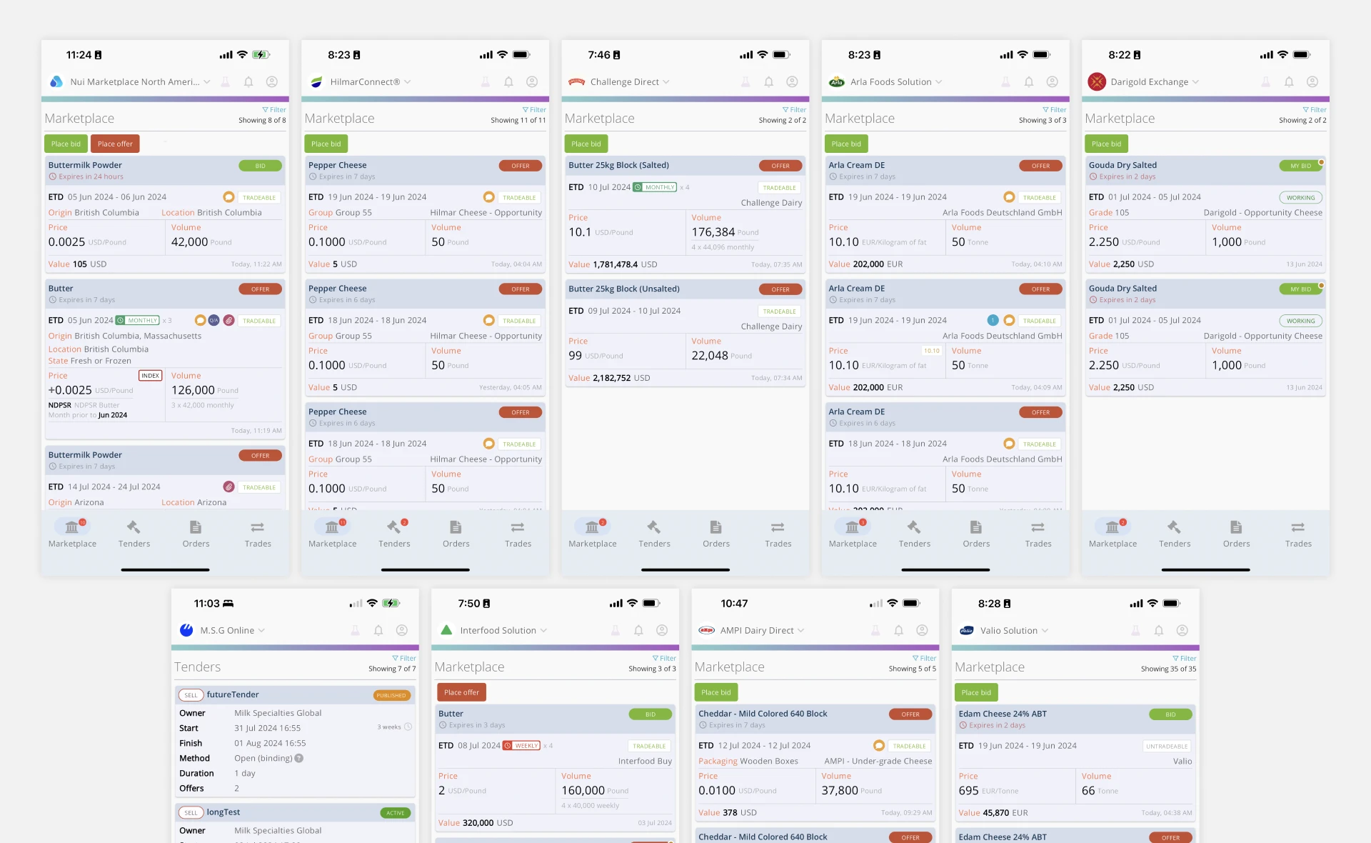
I looked up the platform on the web app. Every client has a theme aligned with their brand identity. Still, the mobile app needs to, which is reducing user satisfaction. The client's customer logged into the mobile app and found it looked like something other than the company they signed up to trade with.
Most heard feedback from stakeholders.
- "This doesn't look like Nui?"
- "This doesn't look like Hilmar?"
Context: Nui Enterprise is a private trading platform for individual companies, where the companies are sellers. When the companies sign up for the Nui Enterprise, they will have their own theme and brand identity.
The solution
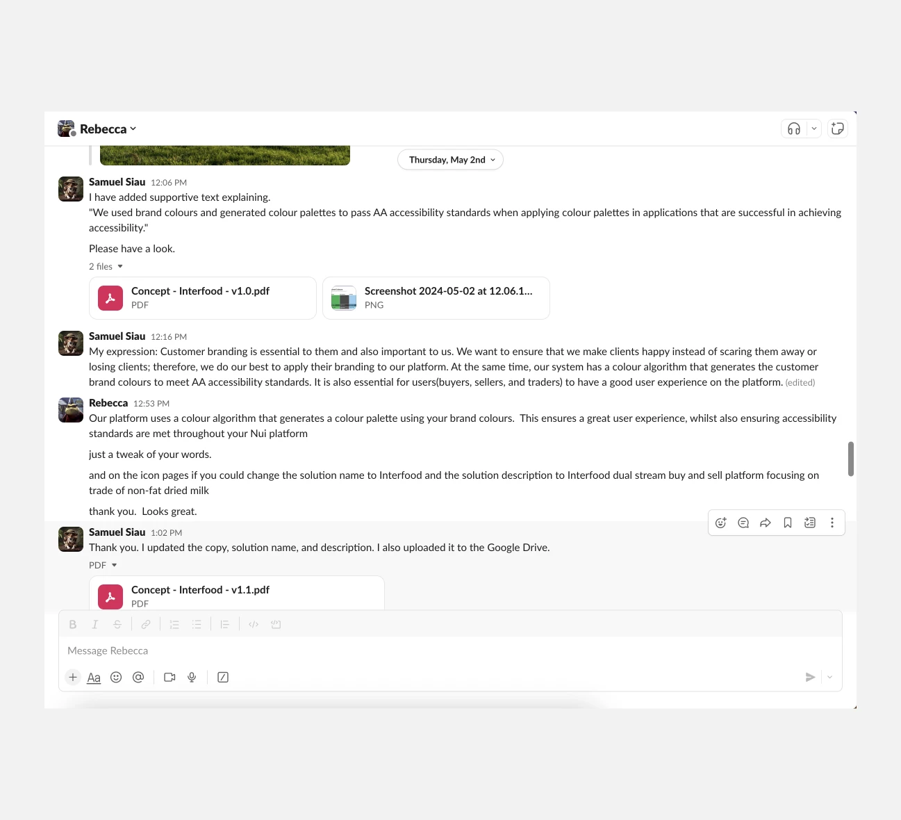
I partnered with my manager and suggested incorporating their brand colour into the mobile app. I made a PDF to showcase how their brand colour would look on the platform and then shared the PDF with all of the clients for approval. The good news is that the clients are delighted with the changes.
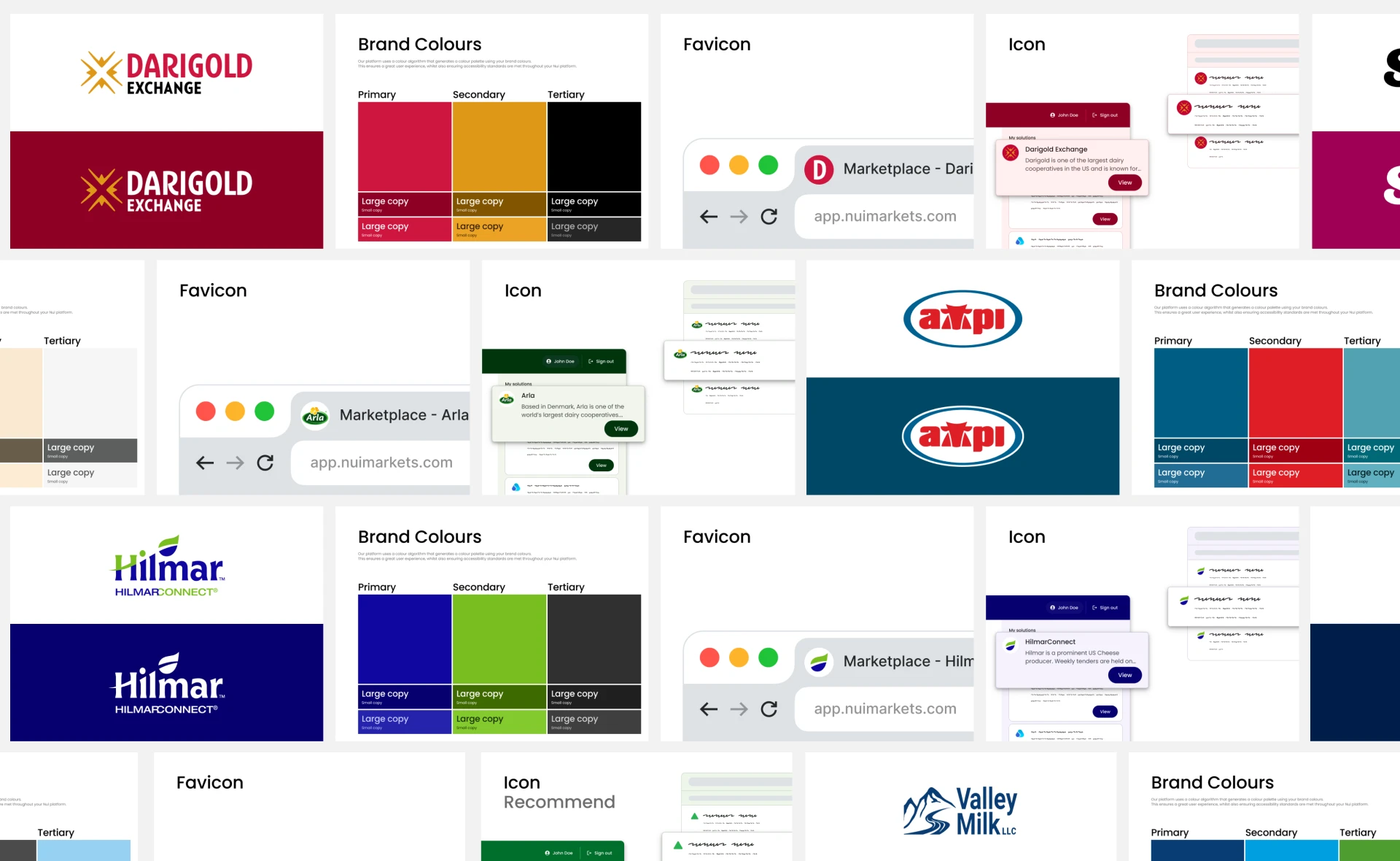
Applied the Nui and client's brand theme colour to the mobile app.
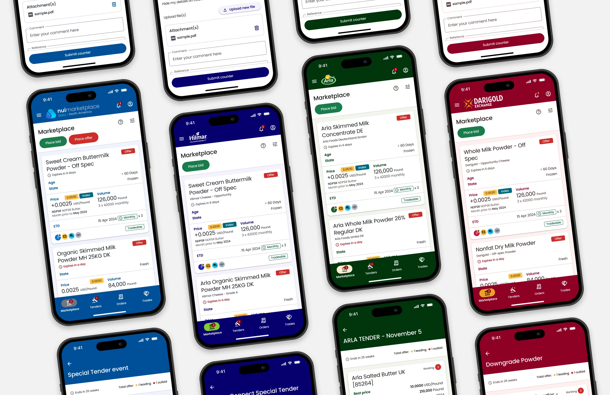
Outcome
This is crucial to aligning the mobile app with the company's brand identity. By doing so, we significantly improve user satisfaction. The client's customers immediately recognise a specific company they trade with.
The challenges and recommendations on usability, legibility, and functionality.
We are facing challenges in redesigning our project. As we go through the overhaul, we identify technical limitations, complex features, and user experience issues. It's crucial to keep stakeholders informed about the progress and address these issues individually. I have organised feedback and issues in one place. Despite the complexity, it's important to take action and make progress.
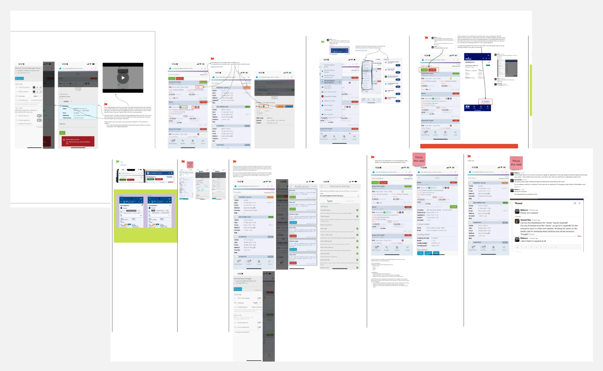
There are more challenges, but I show here a couple of highlights.
No. 1
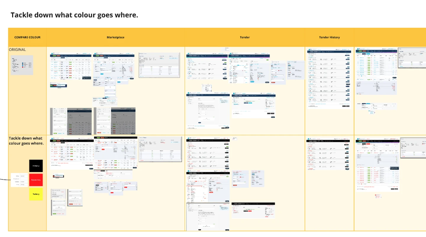
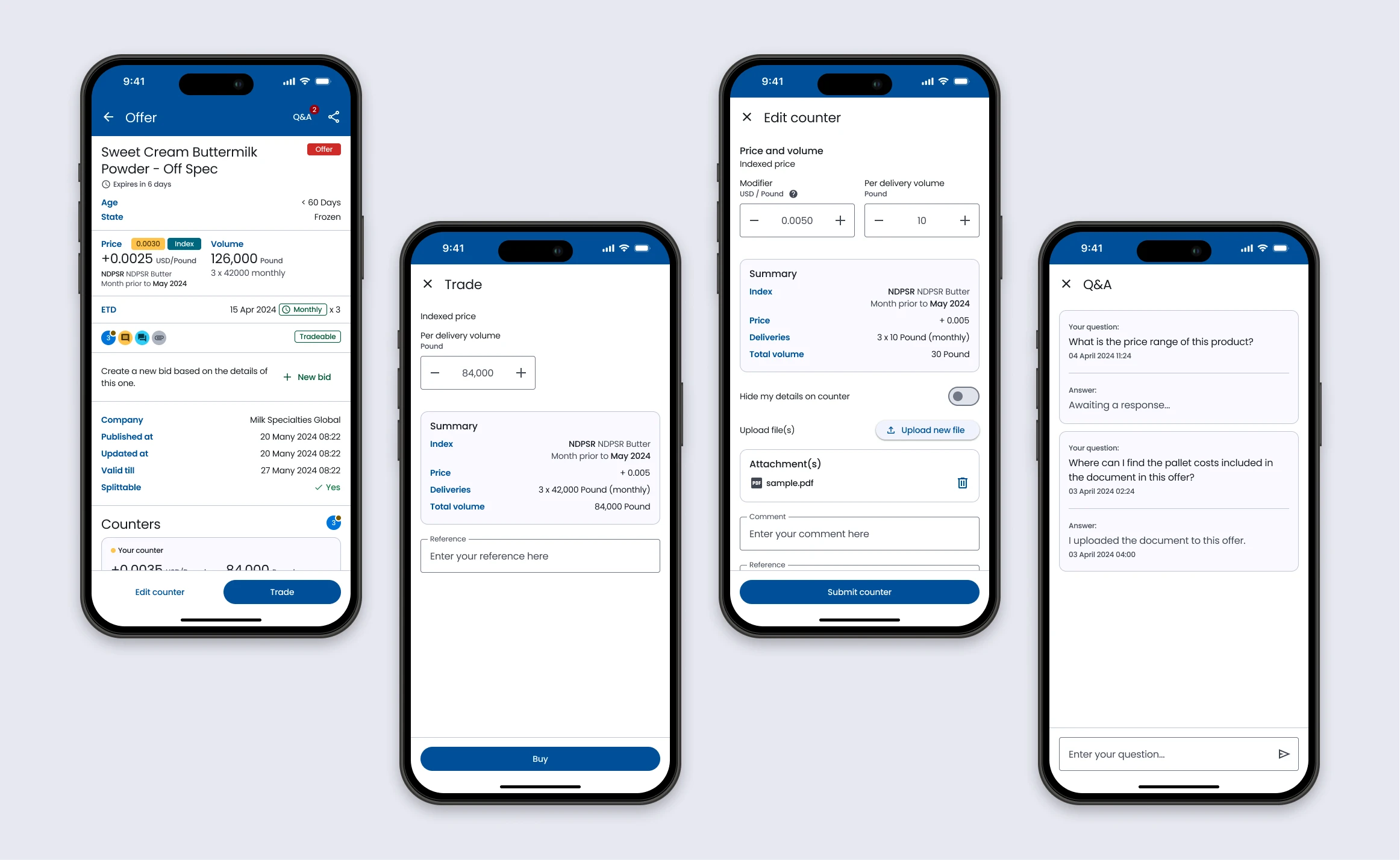
The insufficient contrast between background and foreground makes it difficult for the user to scan the content and decide on an action.
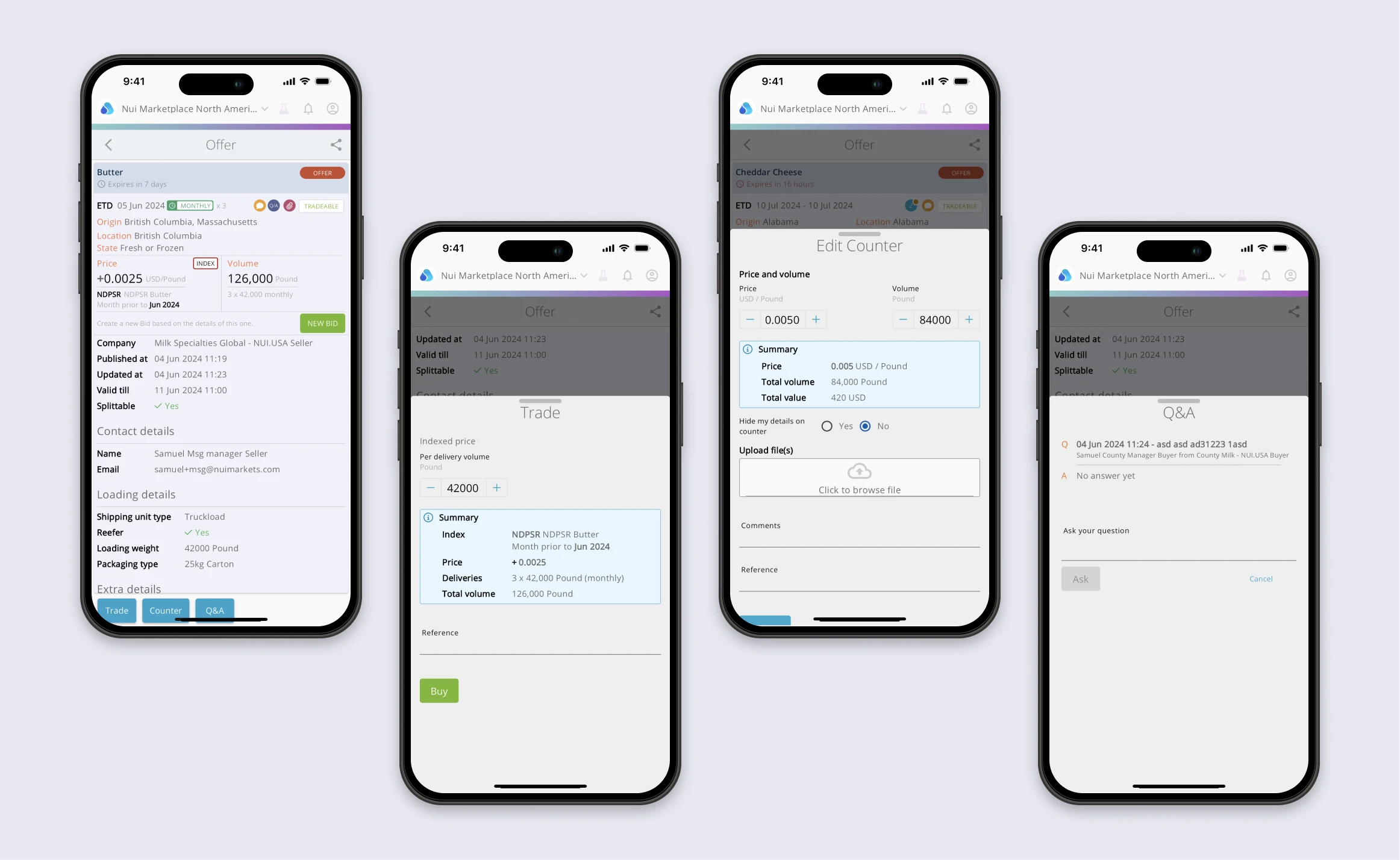
When I presented my plan and identified areas for improvement to stakeholders. They also agreed they heard much of what our clients and clients' customers said about the mobile app's being unreadable.
In addition, the grey text is displayed on a grey background, making it difficult for the user to read. I checked the mobile app's source code, which uses a thinner font-weight!
Especially on Trade, Counter, and Edit Counter are the most important features in the platform to generate revenue for Nui Markets.
The solution
To improve the contrast, change the text and background colours. Increase or adjust the font size and weight, making the text more legible or enhancing readability. Ensure user experience aligns with accessibility standards, such as WCAG colour contrast ratios. However, the Material 3 design already incorporates accessibility and usability for colour. It's still worth checking with WCAG for colour contrast.
The outcome
The users can read it without effort and make good use of the information we want to convey, improving the overall user experience. Importantly, accessibility makes perfect business sense. It helps Nui Markets access a wider and more diverse range of customers and stand out from competitors not focused on accessibility.
No. 2
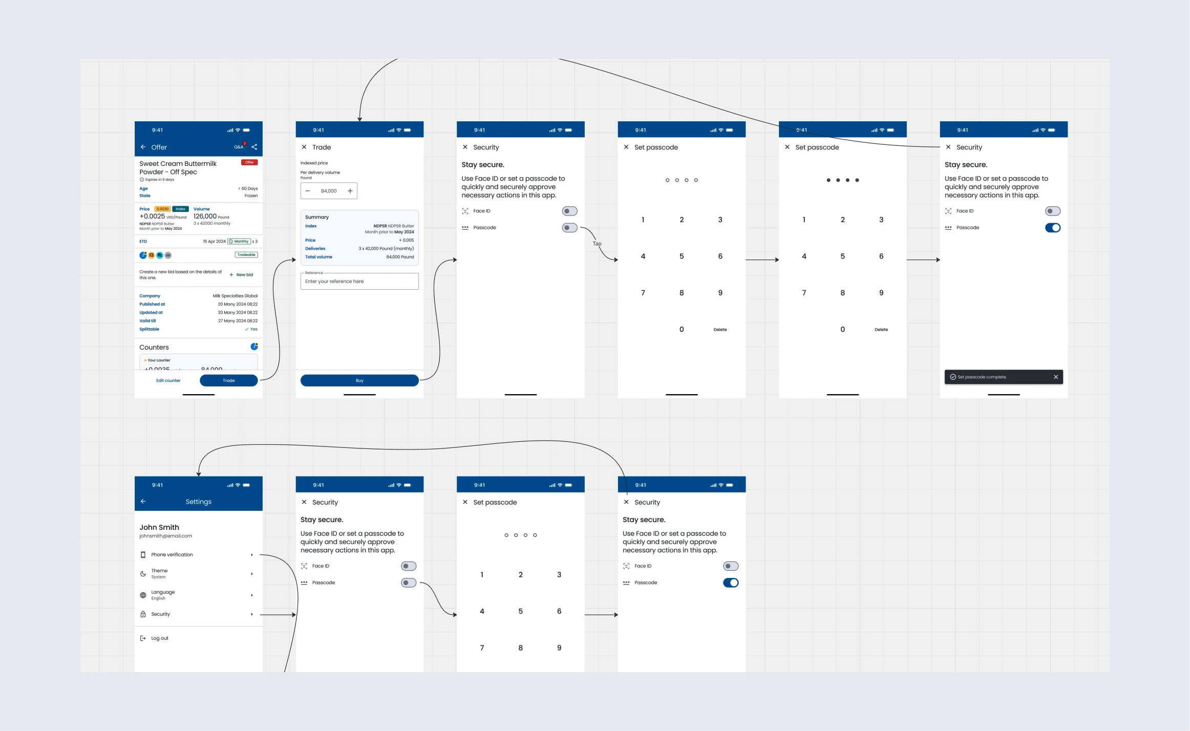
There is unclear and confusing feedback for the users to understand what to do.
The immediately opened drawer and the toast banner message functionality need improvement. If a user attempts to trade but straightaway provides the feedback, "Authorisation not set. You need to set up a security method first", what does that mean to the user?
Users may need help understanding and achieving their goals, leading to confusion, wrong paths, and a negative experience.
The solution
The flow must clearly tell users how to achieve their goals by rewriting the message and providing guidance.
I recalled reading a book called "Don't Make Me Think". I learned from this book:
- "Make it obvious. When you want someone to do something, make it super clear what you want them to do. Don't make them guess."
- "When someone does something, tell them what happened. Did it work? Did it not work? Let them know!"
These two perfectly fit in to solve this problem within this scenario.
Finally, about this project
We'll address current challenges by simplifying complex features, prioritising urgent issues, and conducting thorough technical audits and user testing. Regular stakeholder updates will keep everyone informed, and we'll make steady progress by breaking the redesign into manageable tasks. Ultimately, we aim to deliver a streamlined, user-friendly product that meets technical requirements and user needs, positioning us strongly in the market.